Mobile App
Options for mobile online scheduling.
Options for mobile online scheduling.
Allow studio customers to book group fitness classes using mobile devices.
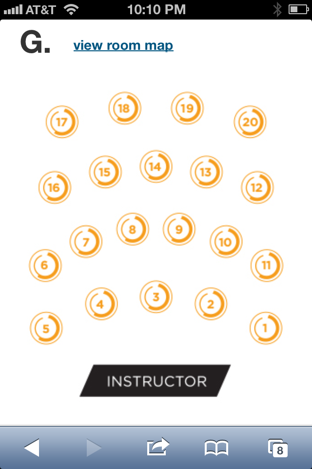
Bookable spots are rendered in a list layout on mobile. Therefore a mobile booking map (300px wide) is necessary to properly orient website customers to where each bike is placed in the studio relative to the instructor.

Options for mobile are determined by whether your website is designed to be "responsive", or optimized for mobile devices.
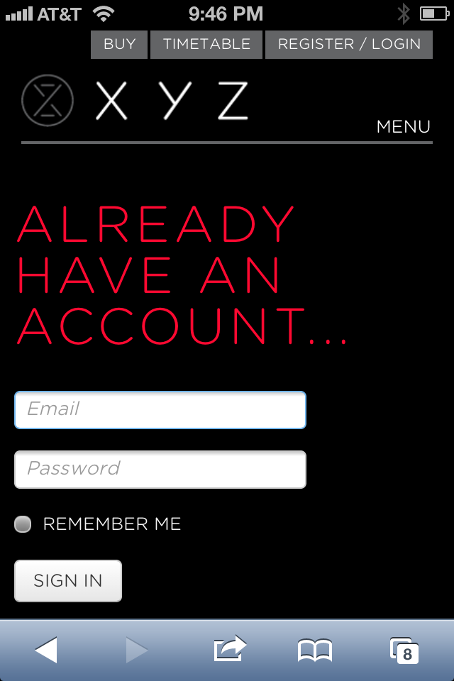
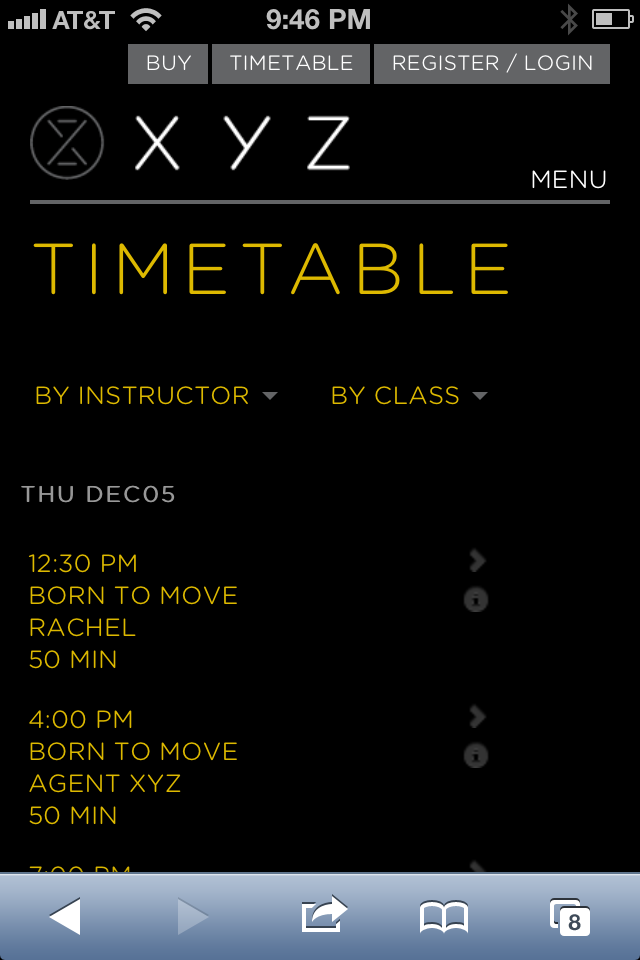
For non-responsive website, the mobile web app displays when the site user clicks on the schedule link (zingfit does offer the ability to direct ALL mobile web traffic to the zingFit mobile web app). The scheduling interface uses a clean, modern layout, and the studio has the ability upload a mobile icon (40px high) via the zingFit admin to brand the web app header.
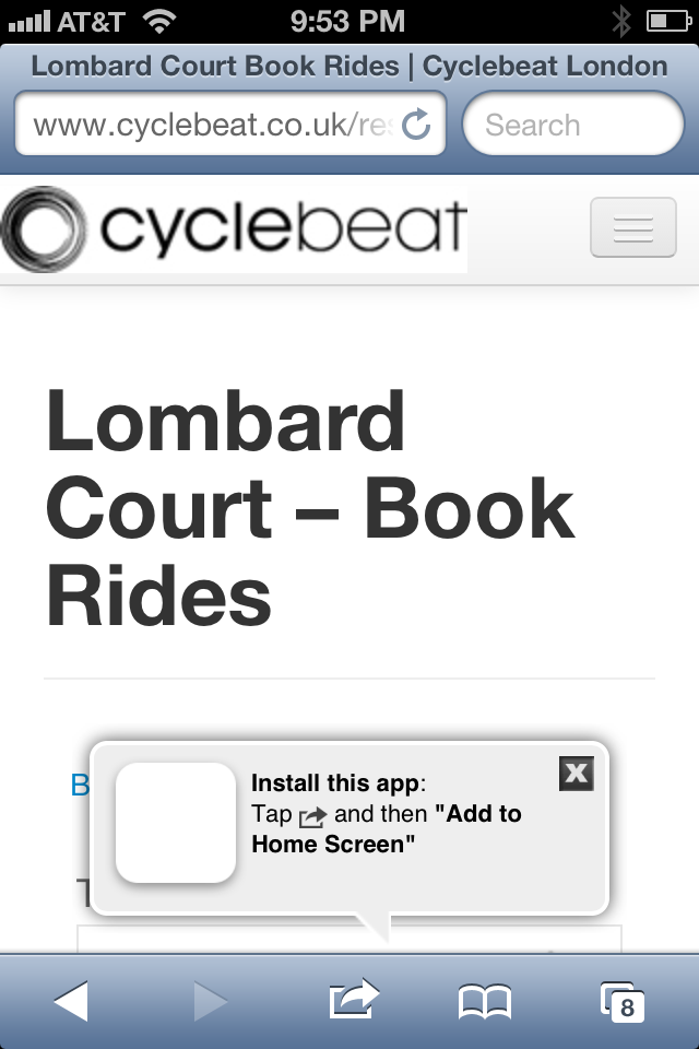
As an added benefit, zingFit prompts the mobile user on iOS and Android to bookmark the website (example shown below). The bookmark prompt appears only on the first user visit and does not appear again.
Websites that are designed responsively have additional mobile branding options. The design wrapper from the website, including typography and CSS styling, can be used throughout the scheduling session.
As mentioned in the Non-responsive Wrapper section above, the zingFit system prompts the user to bookmark the website on the initial visit. There is an option on mobile devices to place the bookmark on the home screen. By default, the home screen icon will be a screenshot of the webpage, but if an icon is installed on the webpage (144 x 144px), the bookmark will appear more as a traditional "app".